
ControlTemplateとは
CustomControlの見た目を再定義できる機能です。
使い時
CustomControlの機能はそのままに、見た目だけ変更したいとき
また、CustomControlの中にあとからコントロールを足したくなったときにも使えます。
使い方
ここでは、ボーダーの中にラベルがはいったBorderLabelカスタムコントロールの見た目を変更していきます。
BorderLabelコントロールは以下のように定義します。
<!--BorderTextTemplate.xaml-->
<ContentView ...>

    <Border BindingContext="{x:Reference this}"
            BackgroundColor="{Binding BorderBackgroundColor, FallbackValue='White'}"
            WidthRequest="100"
            HeightRequest="100">

        <Label Text="{Binding LabelText}"
               VerticalOptions="Center"/>

    </Border>
</ContentView>
//BorderTextTemplate.xaml.cs
namespace BlogDatas.Templates;

public partial class BorderTextTemplate : ContentView
{
	public static readonly BindableProperty BorderBackgroundColorProperty = BindableProperty.Create(nameof(BorderBackgroundColor), typeof(Color), typeof(BorderTextTemplate), Colors.White);
	public static readonly BindableProperty LabelTextProperty = BindableProperty.Create(nameof(LabelText), typeof(string), typeof(BorderTextTemplate), string.Empty);

	public Color BorderBackgroundColor
	{
		get => (Color)GetValue(BorderBackgroundColorProperty);
		set => SetValue(BorderBackgroundColorProperty, value);
	}

	public string LabelText
	{
		get => (string)GetValue(LabelTextProperty);
		set => SetValue(LabelTextProperty, value);
	}

	public BorderTextTemplate()
	{
		InitializeComponent();
	}
}
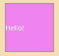
これをこのままページに載せると以下のようになります。
<!--MainPage.xaml-->
<ContentPage ...
    xmlns:customcontrol ="clr-namespace:BlogDatas.Templates">

    <VerticalStackLayout>
        <customcontrol:BorderTextTemplate LabelText="Hello!"
                                          BorderBackgroundColor="Violet"/>
    </VerticalStackLayout>

</ContentPage>
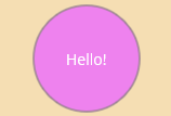
さて、ここでこのカスタムコントロールのボーダーの形を円形に変更したいとします。
ControlTemplateをページに作成し、コントロールに設定します。
<!--MainPage.xaml-->
<ContentPage ...
	     xmlns:customcontrol ="clr-namespace:BlogDatas.Templates">

    <ContentPage.Resources>
        <ControlTemplate x:Key="CircleBoderLabel">
            <Border BindingContext="{Binding Source={RelativeSource TemplatedParent}}"
                    BackgroundColor="{Binding BorderBackgroundColor}"
                    StrokeShape="Ellipse">
                <Grid>
                    <Label Text="{Binding LabelText}"
                           VerticalOptions="Center" HorizontalOptions="Center"/>
                </Grid>
            </Border>
        </ControlTemplate>
    </ContentPage.Resources>

    <VerticalStackLayout Margin="10">
        <customcontrol:BorderTextTemplate LabelText="Hello!"
                                          BorderBackgroundColor="Violet"
                                          ControlTemplate="{StaticResource CircleBoderLabel}"
                                          HeightRequest="100"
                                          WidthRequest="100"/>
    </VerticalStackLayout>
</ContentPage>
これで、もとのカスタムコントロールを一切変更せずに、新たなUIを定義できました。
実行すると以下のようになります。
ContentPresenter
要求が変化して、BorderLabelコントロールの中にボタンを追加しなければいけない状況になったとします。そんなときの対処法があります。
ControlTemplateにContentPresenterを導入しましょう。
やり方は簡単テンプレートの中に一文たすだけです。
<!--MainPage.xaml-->
<ContentPage ...
	     xmlns:customcontrol ="clr-namespace:BlogDatas.Templates">

    <ContentPage.Resources>
        <ControlTemplate x:Key="CircleBoderLabel">
            <Border BindingContext="{Binding Source={RelativeSource TemplatedParent}}"
                    BackgroundColor="{Binding BorderBackgroundColor}"
                    StrokeShape="Ellipse">
                <Grid RowDefinitions="*,*">
                    <Label Text="{Binding LabelText}"
                           VerticalOptions="Center" HorizontalOptions="Center"
                           Grid.Row="0"/>
                    <ContentPresenter Grid.Row="1"/>
                </Grid>
            </Border>
        </ControlTemplate>
    </ContentPage.Resources>

    <VerticalStackLayout Margin="10">
        <customcontrol:BorderTextTemplate LabelText="Hello!"
                                          BorderBackgroundColor="Violet"
                                          ControlTemplate="{StaticResource CircleBoderLabel}"
                                          HeightRequest="150"
                                          WidthRequest="150">
            <Button Text="Button"
                    HeightRequest="40" WidthRequest="75"/>

        </customcontrol:BorderTextTemplate>
    </VerticalStackLayout>
</ContentPage>
これだけで、新しくコントロールを足せます。実際に使ってみます。
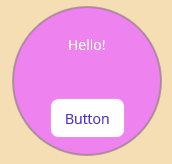
これで急な要求変化にも対処できますね。
まとめ
ControlTemplateで、見た目の変更とコントロールの追加が簡単に行なえることを紹介しました、是非つかってみてください。