

CustomControlとは
CustomControlは自分で作れるコントロールです。ラベルやグリッドなどを組み合わせて1つのコントロールとして登録できます。
これを使うメリットの一つは、可読性が向上することです。
CustomControlを使えばあなたが、XAMLで20行の複雑なコントロールを何度も書く代わりに、2行の単純なコントロールを何度も書くだけで済みます。
どんな所で使えるか
まず、コントロールのセットをたくさん配置するような場面。例えば人の写真と名前がセットになったコントロールを100人分作りたいときなどに使えます。
また、複雑なコントロールを何度か用いるときにも役立ちます。例えば計算用に電卓のコントロールを各所に配置したいとき。0~9のボタンを毎回つくるかわりに、 CustomControlで電卓のコントロールをつくってそれを貼り付けることができます。
使い方
わかりやすいように簡単なものを作り使い方を紹介します。ここでは、Borderコントロールの中にTextコントロールがあるBorderTextTemplateを作ってみます。
作成準備
まず始めにVisualStudioでプロジェクトを開きます。 プロジェクトの[プロジェクト]=>[新しい項目の追加]を押します。
新たなウィンドウがひらいたら、その中の[.NetMAUI]=>[.NET MAUI ContentView(XAML)]を選択して、BorderTextTemplateとつけて追加します。これで、作成準備が整います。
基本の使いかた
追加したContentViewに以下のように記述します。
Xaml
<!--BorderTextTemplate.xaml-->
<ContentView ...
             x:Class="BlogDatas.Templates.BorderTextTemplate"
             x:Name="this">

    <Border BindingContext="{x:Reference this}"
            BackgroundColor="{Binding BorderBackgroundColor, FallbackValue='White'}"
            WidthRequest="100"
            HeightRequest="100">

        <Label Text="{Binding LabelText}"
               VerticalOptions="Center"/>

    </Border>
</ContentView>
C#
//BorderTextTemplate.xaml.cs
namespace BlogDatas.Templates;

public partial class BorderTextTemplate : ContentView
{
	public static readonly BindableProperty BorderBackgroundColorProperty = BindableProperty.Create(nameof(BorderBackgroundColor), typeof(Color), typeof(BorderTextTemplate), Colors.White);
	public static readonly BindableProperty LabelTextProperty = BindableProperty.Create(nameof(LabelText), typeof(string), typeof(BorderTextTemplate), string.Empty);

	public Color BorderBackgroundColor
	{
		get => (Color)GetValue(BorderBackgroundColorProperty);
		set => SetValue(BorderBackgroundColorProperty, value);
	}

	public string LabelText
	{
		get => (string)GetValue(LabelTextProperty);
		set => SetValue(LabelTextProperty, value);
	}

	public BorderTextTemplate()
	{
		InitializeComponent();
	}
}
使用するときにページからプロパティを呼び出したいときは,ContentViewのC#のコードにBindablePropertyと対応するプロパティがページで使うプロパティの数だけ必要になります。
ここでは、Borderの背景色とLabelの文章のみを設定していますが、Borderの線色やLabelの文字フォントを設定することもできます。
BindablePropertyを作る時は以下の形式で記述します。
BindableProperty.Create(プロパティの名前, プロパティのデータ形式, プロパティがあるクラスの名前, 初期値)それでは、このCustomControlを使ってみましょう。
表示できるページ(MainPageなど)に以下のように書きます。
ページ
<ContentPage ...
xmlns:control="clr-namespace:BlogDatas.Templates">
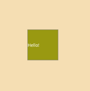
<control:BorderTextTemplate BorderBackgroundColor="#991"
LabelText="Hello!"/>
</ContentPage>完成品
Borderの中身を外から決める
Borderの中のコントロールをページから操作できるようにしてみます.
さきほど使ったBorderLabelのXamlとコードを少しだけ変更します。
XAML
<!--BorderTextTemplate.xmal-->

<ContentView ...
             x:Class="BlogDatas.Templates.BorderTextTemplate"
             x:Name="this">

    <Border BindingContext="{x:Reference this}"
            BackgroundColor="{Binding BorderBackgroundColor, FallbackValue='White'}"
            WidthRequest="100"
            HeightRequest="100"
            Content="{Binding BorderContent}">
    </Border>
</ContentView>
C#
//BorderTextTemplate.xaml.cs
namespace BlogDatas.Templates;

public partial class BorderTextTemplate : ContentView
{
	public static readonly BindableProperty BorderBackgroundColorProperty = BindableProperty.Create(nameof(BorderBackgroundColor), typeof(Color), typeof(BorderTextTemplate), Colors.White);

	public static readonly BindableProperty BorderContentProperty = BindableProperty.Create(nameof(BorderContent), typeof(View), typeof(BorderTextTemplate));

	public View BorderContent
	{
		get { return (View)GetValue(BorderContentProperty); }
		set { SetValue(BorderContentProperty, value); }
	}

	public Color BorderBackgroundColor
	{
		get => (Color)GetValue(BorderBackgroundColorProperty);
		set => SetValue(BorderBackgroundColorProperty, value);
	}

	public string LabelText
	{
		get => (string)GetValue(LabelTextProperty);
		set => SetValue(LabelTextProperty, value);
	}

	public BorderTextTemplate()
	{
		InitializeComponent();
	}
}
違いがわかりましたか?
中身がViewのプロパティをつくり、BorderのContentsにバインドしています。
詳しく言うと、コードでViewクラスのBorderContentプロパティを作成して、それをXamlでBorderのContentに追加しました。
これにより、Borderにコントロールが追加できるようになりました。
実際に使ってみます。
ページ
<ContentPage ...
             xmlns:control="clr-namespace:BlogDatas.Templates">

    <control:BorderTextTemplate BorderBackgroundColor="#991">
        <control:BorderTextTemplate.BorderContent>
            <Button Text="Button"
                    HeightRequest="60"/>
        </control:BorderTextTemplate.BorderContent>
    </control:BorderTextTemplate>
</ContentPage>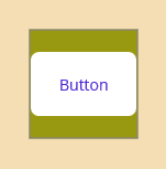
作ったBorderContntプロパティにButtonをいれてみました。予定通りの位置に新たなButtonができましたね。
まとめ
今回はカスタムコントロールの簡単な使い方について紹介させていただきました.使用するとぐっとコードが読みやすくなります.ぜひ使ってみてください.
参考
Microsoft「ContentView – .NET MAUI | Microsoft Learn」<https://learn.microsoft.com/ja-jp/dotnet/maui/user-interface/controls/contentview>(2022/10/25)